Tuesday 24 August 2010

internationalposter.com


I can't remember when I first saw this website, I just found it in the 'Interesting Sites' folder on my desktop (I have to keep one of those because I have a horrendous memory). But they have a great collection of posters online available to buy, although they may put a large dent in your wallet. Their actual Gallery is in Boston, and they have over 10,000 original vintage posters there, but I like browsing the website for some interesting layout ideas and inspiration. Above are some of my faves from my browsing sessions
so far.

Sunday 22 August 2010

Chap.


I first saw this magazine in Edinburgh a couple of months ago, but apparently it's stocked in Leeds University Union as well. I was just reminded of it by one of my friends looking particularly Chap today. I wouldn't say I'm a Chapette, although I do appreciate a good pair of brogues... but I do really like the idea behind the magazine and the way its quite tongue-in- cheek. The magazine seems to be filling a niche as there has definitely been a resurgence in dressing in traditional gentleman attire. Check them out online, be sure not to miss the Chap Manifesto.

Hanging Around


I found this shoot on vicestyle.com by Claudio Campo-Garcia. I like how he's used everyday, otherwise mundane locations and how the models interact with them, creating some interesting forms. I particularly like the second one, it reminds me of the series of self-portraits by Sam Taylor-Wood. Below is Suspended VII by Taylor-Wood. I saw this at a gallery recently, I think it's really striking. The artist suspended herself with wires which were later edited out. She had recently recovered from breast cancer and I think the images portray some of the tension between her physical body and mind.


Tuesday 17 August 2010

King of the Castle


I often go to Castle Market in Sheffield to buy bits and
bobs like material from the stalls there. I find it a really interesting place; it's a council owned building and gives stallholders access to low rent stalls. It's not the nicest of places, it looks like it's stuck in the 1970's, yet I find it really visually interesting. One of the things I love about Castle Market is the endless signage, it's all so outdated
yet somehow really works in the environment. I also love people watching there... but I try not to make that too obvious.

It's a Sign


These are photos of an abandoned factory near where I work in Sheffield called Woollens Signs. Every time I'm walking near by I always notice a different Woollens Signs sign affixed to another part of the building. I like to think that whenever they didn't have any jobs on, they made themselves another sign. I love how they are all so different as well, like they were showcasing their sign-making abilities.

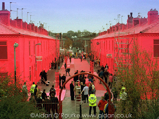
In the Pink


I was just doing a bit of reading in preparation for writing the Big D when I'm back at uni, and i was browsing through Naomi Klein's 'No Logo' when I read about this publicity stunt executed by Mattel in 1997. Basically to promote Barbie they painted a whole street in Salford 'Barbie Pink', as part of their Pink Week which also included painting the Leicester store the same colour. I'd never heard of the campaign, but it seems very modern in its guerilla tactics.
I think it's a great way to generate a massive amount of publicity which will be clearly associated with the brand.

Monday 16 August 2010

Ten Storey Love Song


I saw this article online at the weekend. It's about the 26ft statue that's been put up in Times Square to commemorate 65 years since the end of WW2, its based on the famous photograph taken by Alfred Eisenstaedt of a couple kissing in that location as they celebrated the end of the war. I love it. I think its a great way of reminding us to remember the war, and has been done really nicely. I love how contemporary it looks, yet the clothing of the subjects is so obviously 40's. It also means people will remember in a positive light the end of the war, yet reminds us gently how much so many people went through.

Thursday 12 August 2010

The Man in the High Castle


I've had the book I'm reading at the moment for about 3 years, my mum's read it, I've leant it to friends, it's moved house several times, but it never quite made it to the top of my reading list until now. Anyway it's called The Man in the High Castle and is by Philip K Dick. It's classed as science fiction and isn't something I'd normally read, but i have to admit I'm getting really in to it.
It's about what it would be like if Germany and Japan had won the 2nd World war, it's set in America and the world is obviously completely different. I'd recommend it, I also love this cover design I found online, the edition I have has a nice cover too but this one is really quite clever.

Westwood Strikes Again


One of my friends has started working for Agent2 magazine, and I was checking them out online when I found this article about Vivienne Westwood's recent wallpaper designs for Cole & Sons. The designs are inspired by some of her most iconic fashion collections, shown are the 'Squiggle' print from the Autumn Winter 81/82 Pirate Collection and the 'Cut-Out Laceprint' from the Spring Summer 07 I am Expensive Collection. I love a bit of old school Westwood, she's an amazing lady. It also reminded me about an exhibition I went to last year at the Millennium Galleries in Sheffield, it was all about her career and achievements. I may have a root around and see if I can find any photos, there were some beautiful garments and footwear on show.

Wednesday 11 August 2010


While I was in Leeds at the weekend I finally made the journey to the Royal Armouries, I've been saying for ages I want to go and have a gander seeing as it's free and all that. I wasn't overly impressed with the Museum itself, I realised pretty much as soon as I walked through the door that I have little to no interest in any of the topics it covers. But anyway I still enjoyed visiting Clarence Dock, and found the actual Royal Armouries building really interesting. My sources tell me it was designed by British architect Derek Walker, who also designed the first US-style shopping centre in the UK. I love how it was designed to look like a fortress, fitting the purpose of the build. I also like how although it takes elements from mediaeval castle designs, it's still modern and contemporary; it imposes on the landscape but doesn't dominate it.

Other highlights of the day-trip were the really well thought-out armour display in the huge stairwell, and the horned mask presented to Henry VIII (also used as the armouries logo)... although the mask was a little bit scary.

Thursday 5 August 2010

Lowinsky


I promise this is the last post I will write about my recent trip to Graves Gallery, and I will use this weekend to find some more things that I like.
This little painting is by Thomas Lowinsky and is of the feminist actress, writer and suffragette Cicely Hamilton. Hamilton also co-founded the Women Writers' Suffrage League. I loved the painting because of how finely detailed and descriptive it is, each hair and wrinkle is finely painted and the flesh is given weight and character. It's not the kind of painting I'd normally be drawn to but once I'd started, I couldn't stop looking at it.

Wednesday 4 August 2010

Re-discovering and Re-interpreting


My boyfriend's parents moved house recently, and when we went through all his old stuff we found dozens of T-shirts from when he was about 15. They brought back loads of memories and I loved looking at all the old 'rebellious' messages, skateboarding companies and band logos he had emblazoned across his chest! My favourite was one referring to the Miners Strike in the 80's that showed the Miner's and included a Doors lyric, 'They've got the guns, but we've got the numbers'. Anyway I've decided to make a collection of bags and dresses using said T-shirts, and give them a new look and purpose in life. Here's the first one I've made, using a Napalm Death T-shirt, made in to a rather more feminine strapless dress.

Monday 2 August 2010

The Shire


Whilst I was at the Graves Gallery in Sheffield, I saw this painting by Harry Epworth Allen, 'Derbyshire Walls'. Allen was from Sheffield but spent a lot of time in Derbyshire painting the landscape. I live in Derbyshire and love going out in to the countryside when I can, I've got loads of childhood memories from walking with my family in the Peak District there. I loved this painting because it's so descriptive of the forms found in the land in Derbyshire, and the higgledy-piggledy look of the fields and walls. I also like how Allen has depicted the land and sky as being sculptural yet fluidic at the same time.

Followers